Edit Personal Page Help
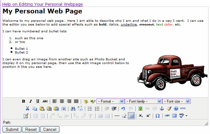
The best way to learn how to use this editor to create your own personal page is to experiment. You will find that using our content editor, creating an HTML web page is much easier than you were expecting. See the screen clipping below for a sampling of just some of the things you can do with your personal page.
Getting Started
Notice that when you click inside the edit window you are able to type. At the bottom of the window is a set of controls that you can use to enhance the text you are typing. You are also able to copy/paste from other documents on your computer including other web pages. As long as you have not enabled your personal page to be listed in the directory, you can take the time you need to experiment with what it will look like.
Most of the icons in the controls should be familiar to you as they are used in most applications that edit text. If you hold your cursor over a control and wait you should see a little tool text popup naming the control. You will also notice that some controls are grayed out. This is normal and occurs because that function isn't needed or can't be applied given where your cursor is located. For example there are a series of table related icons next to the  (insert table) icon. Unless you already have a table and your cursor is inside it, all the other table tools aren't applicable and will be grayed out.
We will cover some of the more complex controls such as links , images , and tables below.
Hyperlinks
"Hyperlinks" or just "links" are the mechanism you use to permit your viewers to click on something that takes them to another web page. To create links you must first understand what is meant by what is commonly known as a "URL". URL is an acronym for a technical term "Uniform Resource Locater" which has become a widespread synonym for "Uniform Resource Identifier" or URI. Technical jargon aside, the URL is what you see in the address or location bar at the top of your browser and will look something like:
Normally when you see a link it is text on the page that is underlined and a different color such as this link back to the top of the page. The underlined text is the "display" portion of the link and the URL is embedded in the underlying HTML.
To create and manage links on your page you need to use the link tools (
 ) on your edit tool bar.
|
Creates a new link or edits an existing link. | |
|
Deletes an existing link (it will only be active when you click in an existing link | |
|
Creates an anchor in your page (see anchors below ) |
Creating or Editing a Link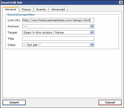
To create a link just select the text you wish to be the display portion of your link (you can also select an image), and click the link icon. Likewise if you want to edit an existing link just click anywhere in the link and click the link icon. When you do this you will see the Insert/edit link dialog (on right).
The most important field in this dialog is the "Link URL". In the clipping you see an absolute URL inserted into the field. Absolute URLs always begin with "http://" or "https://" and are the most sure way to make your link work. In fact the very best way to insert you link URL is to navigate to the page you want to link in another browser window then select, copy the URL from the browser's address bar, and paste this into the "Link URL" field.
Now that you have your link, you need to decide if you want to change the selection in the "Target" field. This tells the browser whether it should just open the new page in the same window (the normal way most links work), open in a new window, or something else. The selections you have are:
- Open in this window / frame
- Open in new window (_blank)
- Open in parent window /frame (_parent)
- Open in top frame (replaces all frames) (_top)
The last two have to do with how to handle the link if you are in a frame (you probably aren't), so your choice should be one of the first two. If you do choose to open in a new window, you should have a good reason to do so. When linking around in one site, it makes the most sense to stay in the same window as the user won't have a bunch of windows to close, but if you are taking the user to another site, for example, these links might start in a new window so that the user still has an open window on the original site. If you are not sure, look at other sites and see how they behave.
See the Anchors section below for what you might put in the "Anchors" field. The "Title" field can be used to insert more specific instructions for the user (you will see this field on some of the other controls as well). When you insert text in this field, the browsers typically display that text as a tool-tip. You see this when you hover the mouse pointer over the link and a small text box appears near your pointer. The class link should be left in its default state.
Notice in the dialog above there are four tabs General, Popup, Events, and Advanced. We have only covered the General tab and for most links that is sufficient. If you are adventuresome and would like to get into more sophisticated linking go ahead and try the other tabs. There is a help section below on advanced hyperlinks .
It is a good idea to check your links (from the site side, not here) periodically to be certain visitors to your site/page find all links active and functioning properly.
Deleting a Link
To delete an existing link just set the cursor anywhere in the link and click . There is no dialog associated with this control but immediately removes the link. You should see the text change color and underline as a result of this. Be careful when clicking this to be sure you have selected the link you want to delete. If you have removed a link by accident, you still can undo that change. When you click on the  undo icon the editor will undo the last change you made.
Anchors
Anchors provide a way to link to a specific position on a given web page. Use them if your page is long and the visitor must scroll up and down to see everything. For example, if you have a topic near the bottom of a long page you can put a link to it near the top or even provide a set of table of content links at the top
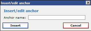 To make this work, the first thing you must do is mark the location on a page that will become the target of your link (the place you jump to when the link is clicked). This mark is called an anchor. Place your cursor at the target location on the page and press the anchor button. You should get a popup like the screen clipping on the right. Enter a name for the anchor, typically one word with no spaces that isn't already used as an anchor on that page and click Insert. Once inserted you should see an anchor symbol (
 ) where you placed the anchor. Note this symbol is only visible in the editor -- on your displayed web page, you will not see the anchors.
Once you have your anchor in place, you are ready to make links to this target. Use the edit link button to bring up the edit link dialog you see above. Rather than pasting or typing a URL in the "Link URL" field, click on the "Anchors" drop down selector. You should see the anchor you just created (along with any others on this page) in a list. Scroll to and click the anchor name you want. You should now see the "Link URL" field replaced by the # character and your anchor name. You can change the "Target" field just as you do with other links and then click "Insert". You may create as many links to a given anchor point as you wish.
You can even link to a know anchor on another page. Let us say that you know that on the page at "http://othersite.com/otherpage.html" you know there is an anchor called "pageBottom". You can link directly to the bottom of this page by using the URL "http://othersite.com/otherpage.html#pageBottom" in your link.
Images
At first you may find working with images a bit tricky, but once you understand some concepts and work with them, you will find images a fun thing to include on your web pages! To see how easy it can be, try opening another website in one browser window and have your web page edit session open in another. You can click on an image on the other site and just drag it onto your edit window and should see it appear there - its as easy as that. Keep reading though as there are things you should understand about images and there are some things you can do to make the image appear as you want it.
It is very important for you to understand that unlike other document formats such as Microsoft Word or even e-mail messages, images on an HTML base web page are NOT "embedded" in the HTML of the page. Rather the HTML references an image file (.jpg, .gif, etc.) in a known location. This known location is quite often in an image or upload directory on your site's server -- but the good news is that it can be on a completely different website. The browsers first download the HTML of your page, then as they parse this HTML, individually download any referenced images and position those images where indicated.
The key thing to remember is that in order for your visitors to see your images they MUST be located in a place that your visitor's browser can access. Common mistakes are to reference a photo on your local computer or even on a company's private network. While you see the image when you view the page, that only happens because your browser has access to locations that are not accessible from the outside. Normally to ensure that your images are always visible, you would upload them first to your site's upload directory. This isn't always possible, as in the case of your personal page on this organization's site.
The next best alternative is to reference images from other public websites. The good news is that there are now a number of websites such as Photo Bucket where you can upload images from 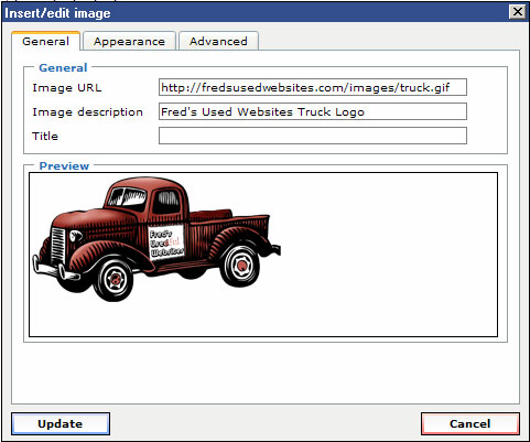 your digital camera, resize them for optimal web viewing, and make them public. Your uploaded images can then be easily referenced on your page and appear as part of it. There are some very easy ways to do this as you will see below.
To insert a new image (or edit the characteristics of an existing image, you will access the insert/access image dialog by clicking on the  icon. You should get a popup dialog as you see on the right. There are three tabs on this dialog (General, Appearance, and Advanced). We will focus on the first two in this section. Features in the Advanced tab are covered in the advanced image section .
The General tab shows you a preview of the image you are editing, and has three fields. As with hyperlinks, the key field is the URL and the most sure way to make sure you have it right is to make it absolute. Notice the "Image URL" field in the example. This tells the browser where the image can be found. You know for sure that you have a working image URL if you paste that URL into your browser and get a web page with just that image. You also know when the URL is correct when you see the preview of the image.
The "Title" field is the same for images as it is for links. When you enter text in this field, the visitor will get a tool-tip type popup with that text when they hover the cursor over the image. If you want this to happen go ahead and fill out the field otherwise leave it blank.
The "Image Description" field isn't absolutely required but you should fill it out and you will get a warning if you click Update without something in the text box. The search engines such as Google actually rate your page based on this descriptive field. It comes into play when someone on a very very slow connection chooses to configure their browser to NOT download the images. Images take much more time and bandwidth than the page itself and for many pages the images are just fluff anyway. When you have an image description, those users will see that description. They can then click on the image place-holder and optionally download just that image.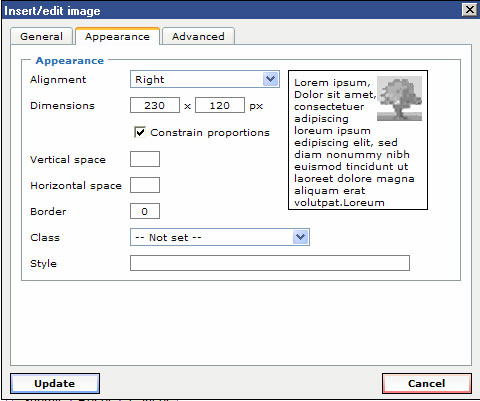
You could stop with the General tab but most often you will want to modify the settings on the Appearance tab. When you click that tab you should see a dialog such as the one on the left. The only two fields that won't be useful to you are the "Class" and the "Style". For now just ignore these fields.
The "Alignment" field sets how the image will appear with the surrounding text. Remember that an image is inserted at the point your cursor is pointing and is placed somewhat like a character of text you type. When alignment is not set or is set to any of the values except "Left" or "Right", the image will appear within the line of type. In the example on the left notice that there is a box with some Latin text plus an image. When you select an alignment option, this box changes to demonstrate the effect.
To show the in-text alignment more clearly we will insert an image that is slightly larger than the text and select alignment values other than right or left. This sentence shows how an image  is placed without setting alignment. Notice how the image is placed almost like a large character inline with the sentence. We can change the alignment to "Middle" to get this effect, or "TextTop" to get this effect. The other two alignment options are "Right" and "Left". Right and left are different from all the other options in that rather than positioning the image vertically relative to the line, the image is floated to the right or left side of the text container and the text flows around it. Many of the screen clippings in this help page were inserted with the right or left alignment option. Go ahead and experiment! Try setting various alignment options to see the effect with your image and text.
The "Dimensions" field is a quick and easy way to change the size of the image displayed on your page. The dimension values are X and Y pixels as displayed on the screen. Bear in mind that the average computer screen today has a screen size of 1024 by 768 pixels so that should give you an idea about what size ranges you should consider. When you check "Constrain proportions", typing a number in either the X or Y box will automatically cause the other one to change to a value that keeps the proportion of the image intact (very important with images of people).
Special NOTE: While it is convenient to change the image size here, it does not change the actual dimensions of the image file on your server. A common mistake is to upload a file directly from a modern digital camera that has dimensions larger than 2000 pixels on a side. While the image looks OK when resized here, the file size is much larger than it needs to be and this greatly impacts your viewers using a slower network connection. Be sure to go back and resize the actual file before you have completed your page.
The "Vertical space" and "Horizontal space" fields allow you to ensure a minimum amount of white space on top/bottom and right/left of your image respectively. Use these when your image appears crowed by the text around it. You may have to try different values but 10 pixels will leave a nice amount of space around the image.
Lastly you can use the "Border" field to insert a solid border around the outside of your image. A border often adds a classy touch to an image, making it stand out clearly.
Tables
Tables are a great way to organize content on your page. Not only are tables used for tabular data but are very commonly used to layout your page into columns or sub-divide into smaller content areas. When you configure the table to be borderless, the viewer just sees your page organized into the smaller content areas. The following is a sample of what you can do. There are 6 content areas below created by a 3 by 3 table that has some cells joined.
|
I can place content in |
This area is two cells that have been joined together. We will use it to describe the table controls. Look for the main table |
|
|
Next to the cell icon you will see a series of icons used to insert and delete rows or columns. |
We created this area by joining two third cells in the 2nd and 3rd rows. It provides a great place to talk about the merge table cells As you can see, by merging cells and inserting new tables inside of cells you can create quite a creative layout. Think about your layout ahead of time. Pencil in some layouts on a sheet of paper and determine how many cells you need to start with. Most of all, just have fun. |
|
 |
Another common use for tables are to create picture galleries. You can insert a photo in one cell and text to describe that in an adjacent cell. Here we have a description on the right and a photo on the left. You could alternate text and photo, create large and small photos, or just about anything you like! Experiment and you will find that a table can be used to create a whole collage of photos. To get my photo centered I simply selected anywhere in that cell, clicked |
|
|
The "Columns" and "Rows" entries are used only when creating a new table and will be grayed out when editing an existing table. As you might expect, they define how many rows and columns the new table should contain. "Cellpadding" and "Cellspacing" actually apply to cells but are here because they are global to the table (i.e. affect all the table cells. When you turn on the border and change these values, you can visually see their impact. Both values are in pixels and default to 2 pixels if not specified. Cellpadding is the padding inside the border between the border and the cell content. Cellspacing is the padding between cells or the space outside the border. The "Alignment" field is used to position the entire table horizontally in the content area in which it is located. You can choose "Left", "Center", or "Right". A non-zero value in "Border" causes the table and cells to have a border. The number represents the number of pixels you wish the border to be thick. "Width" and "Height" are used to define how large the table should appear. If you specify only a number in these fields, this will represent the number of pixels in each dimension. You can also specify a percentage. For example, the table used for this example was set to be 100% wide. All this means is that the table will simply be 100% of the width of the browser in this case. Try it -- when you widen your browser, the table widens along with it. Think about how you want your content to be presented. You could specify a pixel width and center the table and it will stay floated to the middle of your browser page without changing the appearance of the text inside the cells. If width and height are not specified, the content of the cells will drive the actual size. Often you may want to specify a width as we have done in the example and let the height be driven by the content.
You can enter the URL of an image (much like the image dialog) in the "Background image" field. When specified this image becomes the backdrop of the table with the table's content and borders appearing on top of the image. Choosing an image is best done by experiment as you won't know how it impacts your content. Some images for example could make your text almost unreadable. The size of your image is also an important factor. If your image is larger (in pixels) than the table, you will see only the upper left portion with the remainder clipped off, conversely if the image is smaller than the table, it will be repeated, or tiled, in both directions as needed. This tiling can often create a nice quilt work appearance. More often you will find yourself setting a "Background color" rather than using an image. Clicking on the color box to the right of the color brings up a color pallet from which to choose a color. As an alternative you can simply type a color name such as red, blue, yellow, etc in the text box. You can also specify a color by the RGB value which will look like #ffcc00. Using the RGB value is a way to ensure you have the exact color value whenever specifying a color. "Border color" works much the same way as background color and is used to specify the color of the border (if you have specified a border on the General tab. |
||
 icon and the cell
  icon. They are used to set row or cell properties respectively. They will only be active when you click on an area within a table
 inserts a row above the row in which you have placed the cursor,
  inserts a row after, and
  will remove the entire row (and the row contents!). Likewise
  inserts a new column to the left of the currently selected column,
  inserts a column to the right, and
  deletes the entire column (and column contents). They are all easy to use and perform their action immediately without popping up a dialog.
  and split table cells
  icons. Like the controls described on the left, merge and split perform their action immediately and without a popup dialog. To merge cells you need to select adjacent cells. You can use you mouse to select cells by clicking in one and dragging across the cell boundaries into others. This is very much like using your mouse to select text. The selected cells will have their borders highlighted. When you click
 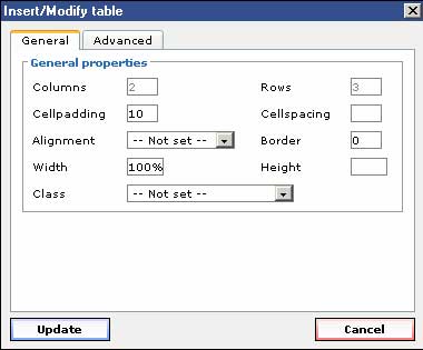 In this section we will cover the dialogs for the table, row, and cell controls. When you create or edit a table there are a number of parameters you can set to alter the look and placement of the table.
 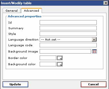 Next we cover the "Advanced" tab. We won't cover all the fields here as they are an advanced topic. Instead we focus on the last three...
Use the text justify icons below to choose where the table should go, then click on the table edit icon (table with pencil), choose the table configuration, insert the table , and populate it.
Advanced Hyperlink Topics
Advanced Image Topics
Miscellaneous
HTML and Spaces:
There are many times where the use of spaces will make your HTML more difficult to read. We recommend that in anchors, image names, etc that you do not use spaces in the name. The reason for this is that are special characters a URL, by definition, cannot contain. The space character is one of these that is commonly used. When you have a space in an anchor name or for the name of an image file, it must have that replaced by a special character sequence (%20) in the URL. This doesn't cause the link to fail, it just makes the URL much harder to read and type in by hand.
For example, if you name an anchor "I am a big bad boy", the URL that must be generated to link to this will be "#I%20am%20a%20big%20bad%20boy". In the broswer's address bar this will look something like "http://www.mysite.com/mypage.html#I%20am%20a%20big%20bad%20boy". If you take the spaces out an capitalize the letters, the URL is much more readable. The name "IAmABigBadBoy" will be "http://www.mysite.com/mypage.html#IAmABigBadBoy".